Color is one of the first things we notice when we enter a space, yet it’s often treated as a purely
aesthetic choice. In reality, color has a deeper role. It shapes mood, influences behavior, and
subtly affects how we experience our homes every day.
In Indian homes especially, color carries cultural, emotional, and functional weight. The right
palette can make a space feel calm, warm, energetic, or grounded—while the wrong one can
quietly disrupt comfort, even if everything else is well designed.
Understanding the psychology behind color helps create interiors that don’t just look good, but
feel right.
Why Color Matters More Than We Think
A home is not experienced in still photographs. It’s lived in—from early mornings to late nights,
through routines, conversations, rest, and movement. Color forms the backdrop of all of this.
Certain colors stimulate the mind. Others slow it down. Some make spaces feel expansive,
while others bring intimacy. When chosen thoughtfully, color supports the purpose of a room
instead of competing with it. In Indian homes, where multiple activities often happen in the same
space, this balance becomes even more important.
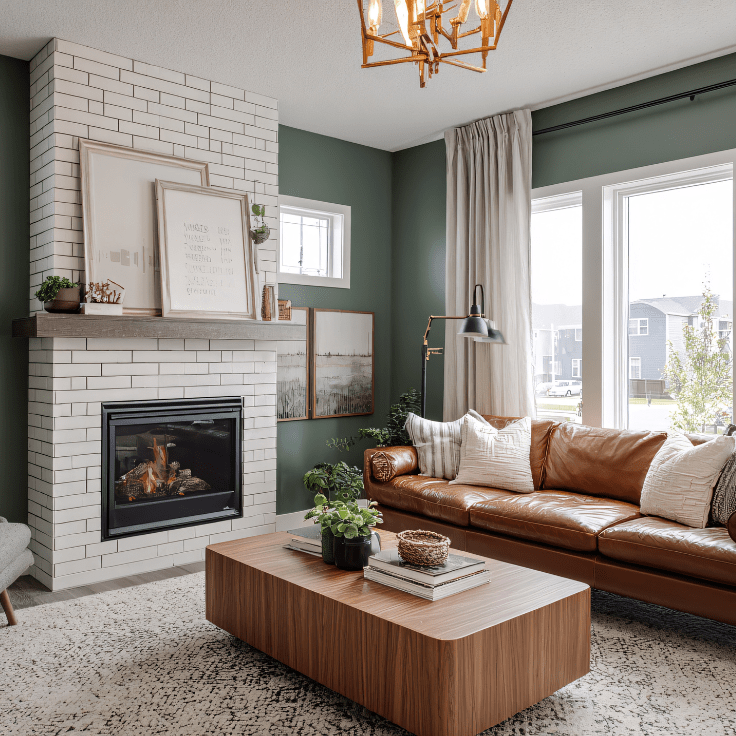
Warm Colors: Energy, Comfort, and Connection
Warm tones such as soft yellows, muted oranges, terracotta, and earthy reds are deeply rooted
in Indian design sensibilities. These shades evoke warmth, familiarity, and a sense of welcome.
Used correctly, warm colors:
- Encourage social interaction
- Make large spaces feel more inviting
- Add character and emotional depth
However, overuse—especially in smaller homes—can make spaces feel heavy. The key lies in
moderation and tone. Softer, muted versions work better than bold, overpowering shades for
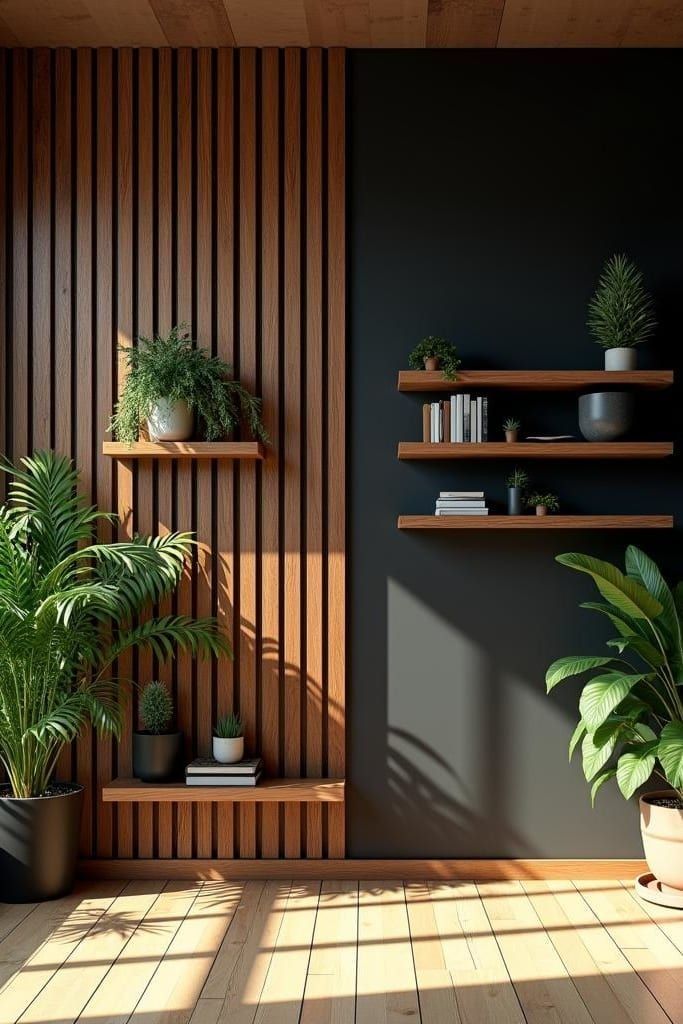
everyday living.Cool colors like blues, greens, and certain greys are associated with calmness and mental
clarity. In a country where daily life is often fast-paced and noisy, these colors provide visual
relief.They are especially effective in:Bedrooms, where rest is essential. Home offices, where focus matters
Spaces that receive ample natural light. In Indian homes, cooler shades paired with warm textures—such as wood or fabric—prevent the space from feeling cold or impersonal.
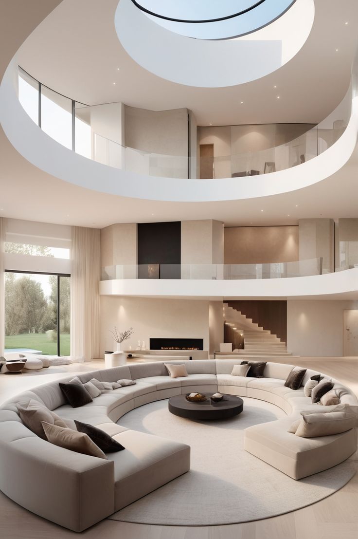
Neutrals: The Quiet Backbone of a Home
Neutral tones are often misunderstood as boring. In reality, they are what allow a home to
breathe. Whites, off-whites, beiges, and greys create a sense of openness and continuity. They reflect
light well and make spaces feel larger—an important factor in urban Indian homes.
Neutrals work best when layered thoughtfully:
- Varying textures instead of multiple colors.
- Warm and cool undertones balanced carefully.
- Accents introduced through furniture, art, or soft furnishings.
- A neutral base allows the home to evolve over time without constant redesign.
Cultural Influence and Emotional Memory
In Indian households, color is often tied to memory and meaning. Certain shades remind us of
ancestral homes, festivals, or regional traditions. Ignoring this emotional layer can make a
space feel disconnected from its occupants.
Good interior design acknowledges these associations without being overly literal. Instead of
replicating traditional palettes, it reinterprets them in a modern, subtle way—creating familiarity
without feeling dated.
Color and Space Perception
Color directly affects how we perceive space. Lighter shades open up rooms and enhance natural light and darker tones add depth but need balance. Continuous color flow between rooms creates visual harmony. In compact homes, abrupt color changes can visually break space into smaller sections, making
it feel cramped. A cohesive palette helps spaces feel more expansive and fluid.
Choosing Color With Intention. The most successful interiors don’t use color to impress. They use it to support daily life. Before choosing a palette, it’s important to ask:
How is this space used throughout the day?
Who uses it the most?
What emotion should this room evoke?
When color decisions are guided by these questions, the result feels effortless and
personal.
Designing Homes That Feel Right
Color is not about trends or statements. It’s about the atmosphere. When chosen with care, it
quietly shapes how a home feels—calm or chaotic, warm or distant, grounded or restless. A well-designed Indian home doesn’t rely on color to stand out. It relies on color to belong. Because the best interiors don’t just reflect good taste. They reflect the people who live inside them.
Conclusion
Color is not a finishing touch in interior design; it is a foundation. It shapes how spaces are
experienced long after the furniture is in place and the décor is styled. In Indian homes, where
culture, routine, and emotion are deeply intertwined, color choices carry even greater
significance.When selected with intention, color brings balance—supporting comfort, function, and personal expression without overwhelming the space. It allows a home to feel cohesive, lived-in, and
emotionally grounded rather than designed for momentary appeal.
A well-considered color palette does not demand attention.
It quietly enhances everyday living. And that quiet confidence is what makes a home feel
complete.